

Underwater Trees is a compelling mini-book designed to educate and inspire action to protect coral reefs, referred to as the rainforests of the sea.
The book combines vivid storytelling, scientific insights, and actionable solutions to address critical threats to coral ecosystems, such as overfishing, pollution, global warming, and unregulated tourism.
Its accessible design and relatable language aim to engage readers from diverse backgrounds, with a focus on children aged 8 and up, educators, and environmental enthusiasts.
Coral reefs, vital for marine biodiversity and coastal protection, are rapidly declining due to human activity and climate change.
Key challenges include:
Without immediate intervention, over 90% of coral reefs may vanish by 2050, jeopardizing marine life and livelihoods dependent on these ecosystems.
Underwater Trees raises awareness and empowers readers to take actionable steps, such as:
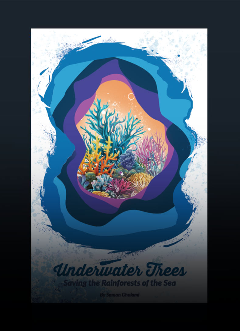
The design of Underwater Trees features a variety of thoughtful design choices intended to engage audiences of all ages with a uniquely tactile book structure, vibrant colors, The layered cut-out effects create a sense of depth, visually representing the underwater environment and the intricate beauty of coral reefs. This layered approach reflects the complexity and fragility of coral ecosystems, with each layer symbolizing different aspects of the reef's interconnected structure.
At the center of the design is an illustrated coral scene that highlights the biodiversity of reefs and emphasizes their ecological importance. This central element serves as an educational focal point, immediately conveying the book's purpose.
The vibrant color palette transitions from deep blues to lighter shades, mirroring the ocean's depths and the vibrant marine life, while inviting viewers into the book's immersive world. The layered cut-out effect produces a striking 3D illusion, encouraging readers to "dive into" the underwater realm, symbolizing the educational journey into coral reef ecosystems.
The carefully selected colors of blues, purples, and oranges reflect the natural hues of coral reefs, evoking their beauty and fragility. This harmonious blend captures the attention of the target audience, especially kids, while remaining visually appealing to adults.
The typography features friendly, rounded characters, aligning with the organic shapes of the design, creating a sense of approachability and warmth. This makes the content accessible to younger audiences while maintaining a professional tone for educators.
Finally, the water splash motifs framing the design add dynamism and subtly remind viewers of the ocean’s fluidity.
Together, these elements enhance the theme of marine conservation and reinforce the book’s connection to underwater ecosystems, resulting in a cohesive and compelling design.

Cori, the main character representing the voice of the coral, is designed with friendly and approachable features (e.g., expressive eyes, vibrant colors, or a playful posture) to capture attention, especially for
younger audiences.
This anthropomorphic coral acts as a relatable guide throughout the story who creates emotional connection to making the material more engaging and less intimidating for children.
By personifying coral, Cori helps humanize the conservation message, building empathy and fostering a connection between readers and the marine environment.
Cori assists in an educational role, as well as the role of mascot introducing topics or emphasizing key points. He helps break down complex ecological concepts (e.g., coral bleaching or symbiosis) into digestible, child-friendly explanations. This aligns well with the target audience of ages 8 and up, ensuring the information is both educational and enjoyable.
Cori’s visually consistent design integrates seamlessly with the overall visual theme of the book, using the same color palette and organic shapes to maintain cohesion. Strengthens the branding and reinforces the connection between the book’s visual and thematic elements.
Interactive Content:
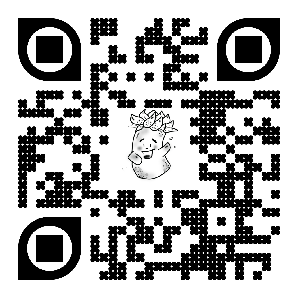
The QR codes embedded throughout the book serve as links to supplementary resources, such as external websites about coral conservation. Adds an interactive, tech-savvy element to the book, appealing to a digitally native audience. It also extends the learning experience beyond the printed page, allowing readers to explore more in-depth content at their own pace.
Audience Engagement:
The QR codes provide a bridge between static content and dynamic media, encouraging readers to actively engage with the material.
Eco-Friendly Solution:
By using QR codes instead of additional printed pages, the book minimizes paper use while maximizing informational depth. Aligns with the book's sustainability message, demonstrating practical eco-conscious choices.

Navigation and Usability:
The upper-right corner of each page provides guidance and acts as a subtle but effective wayfinding and navigational tool. It include brief headings to direct readers to specific section and provides clarity to help readers quickly locate and understand the focus of the page.
Educational Utility:
For educators, this guidance system can act as a quick reference for lesson planning or highlighting critical points for classroom discussions. The wayfinding model makes the book teacher-friendly, aligning with its goal to serve as an educational resource.


As a visual designer, I believe aesthetics is key to improving the user experience. I am eager to learn and excited about new challenges. I am a creative, curious, self-motivated person, enthusiastic about web design, development, and new techniques. I think communication and creative problem-solving is the best way to approach and captivate the audience's need. Nothing can make me more excited than having positive effects on people's lives through visual design.

Got a project in mind?
Let's get in touch.