.png)
Challenge Statement
The Growth is an educational application for women to help them educate themself about their rights in the united state of America. The app has a big target audience, from Low educated and broken families to high-level educated immigrant women that aren't familiar with their rights. The Growth offers two emergency features for protecting women against domestic abuse. This is a social experimental app that works based on the trust and volunteer works of its community. It provides video, audio, reading material, and resources likes lawyers, therapy, shelters, and...
Solution Statement
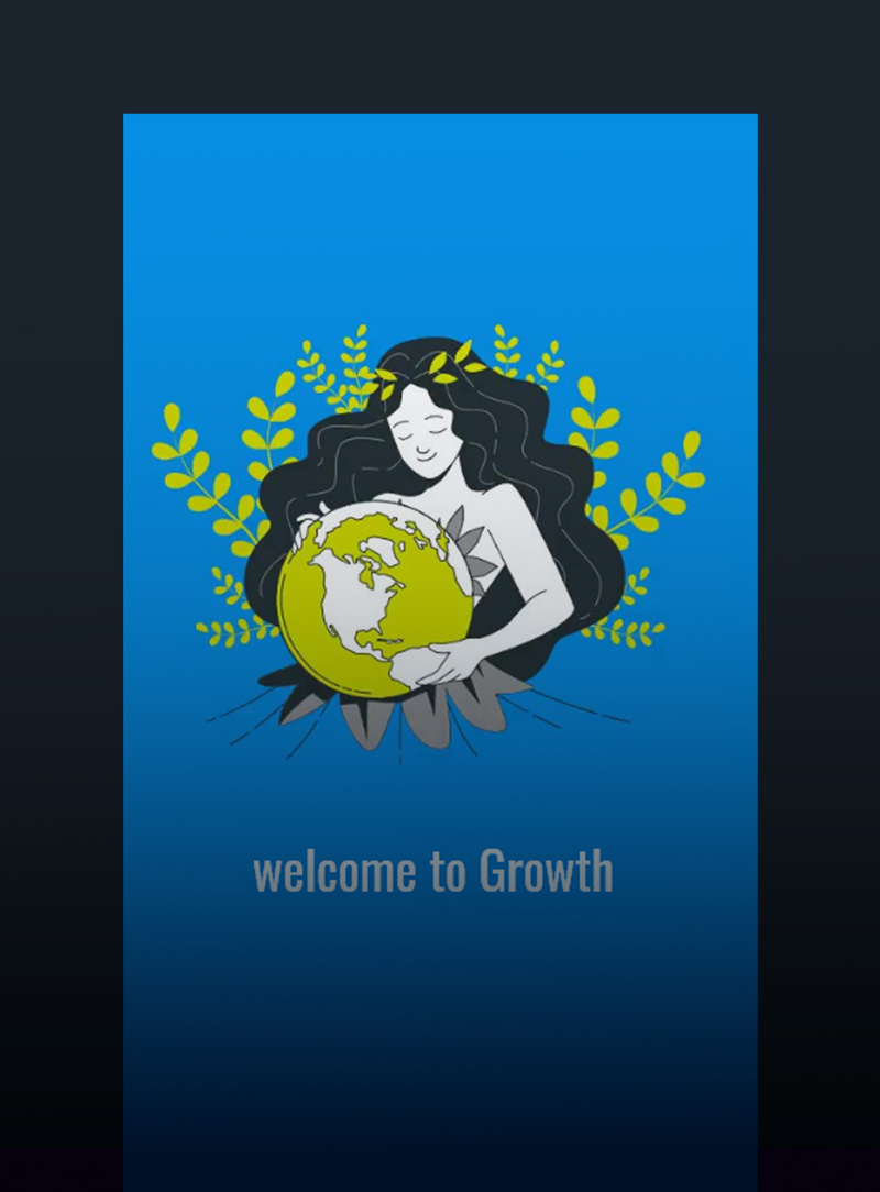
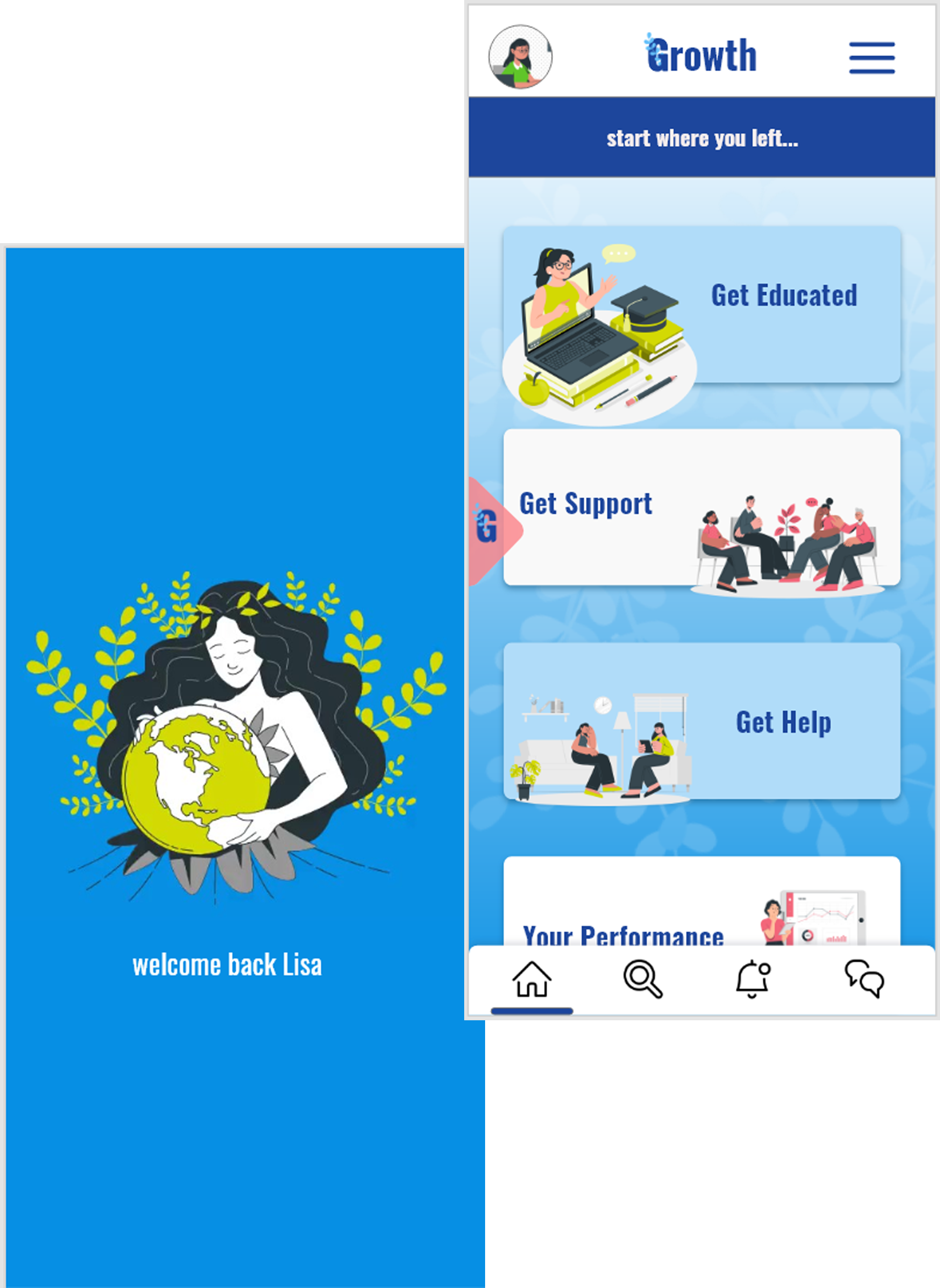
The design of the app is feminine. The rounded buttons, soft gradient, graphics, and illustrations bring softness, feminine feels, and a friendly environment. The color pallet is a combination of blue for trust, green for nature, and white for peace and freedom to create the calming and supporting environment that users needs.
Oswald is the only font used in this design. It is very readable and conveys the seriousness of the situation, and it is suitable for all kinds of media, from reading material to educational slides.
The biggest design challenge was being user-friendly and easy navigating through the app, especially for the second languages users or the low educated ones, so there are lots of illustrations, animation, graphics in its interface with the same color pallet to avoid cluttering and confusion.
Other Projects
Let's work together!
As a visual designer, I believe aesthetics is key to improving the user experience. I am eager to learn and excited about new challenges. I am a creative, curious, self-motivated person, enthusiastic about web design, development, and new techniques. I think communication and creative problem-solving is the best way to approach and captivate the audience's need. Nothing can make me more excited than having positive effects on people's lives through visual design.
Got a project in mind?
Let's get in touch.