.png)
Kid Code - Brief
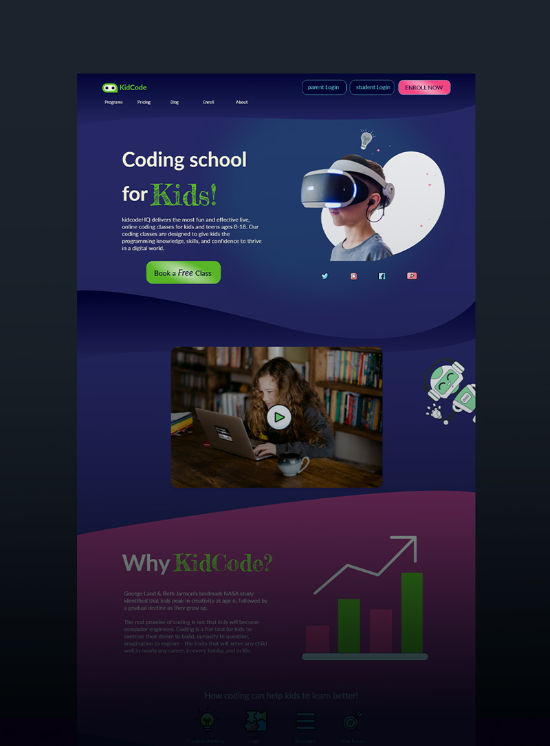
KidCode is an online coding school designed for children ages 8–18. The goal of this project was to design a vibrant, user-friendly landing page that speaks to both children and their parents—instilling trust while also engaging young users with interactive, playful elements.
The primary call to action was to encourage enrollment in free classes by highlighting the program’s benefits, course levels, and real-world parent testimonials.
Kid Code - Target Audience
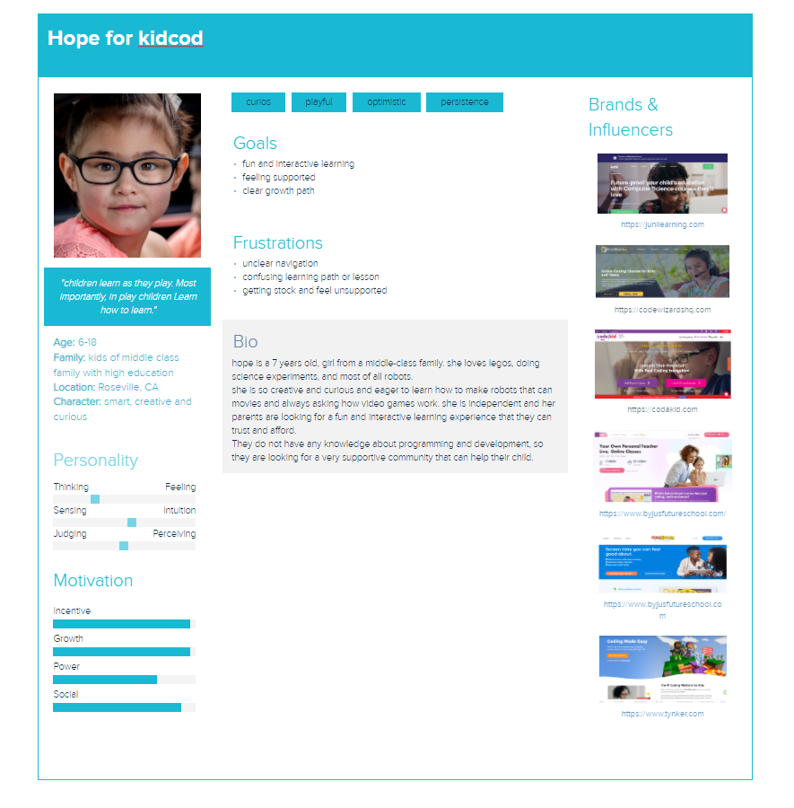
- Primary: Parents of kids interested in coding, gaming, and robotics
- Secondary: The children themselves—who respond to bright colors, playfulness, and gamified UI elements
Key Expectations:
- A playful and professional tone that builds trust
- Easy-to-use interface for non-tech-savvy parents
- Engaging visuals and gamified features for kids
- Seamless experience across devices
Kid Code - The Challenge
- Balance visual playfulness for kids with professionalism for parents
- Simplify the course structure (Level I, II, III) and drive clear action for signups
- Integrate dynamic content (video, testimonials, badges) without overwhelming the layout
- Encourage user interaction with minimal friction and maximum clarity
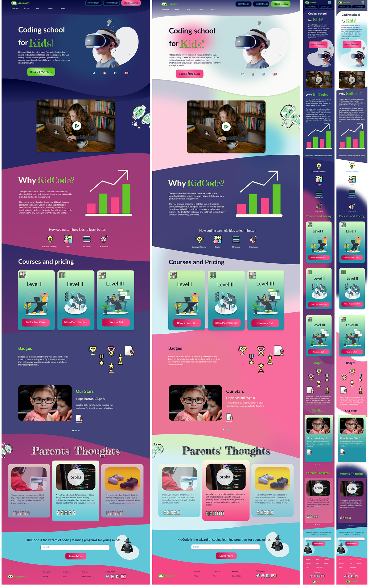
Kid Code - Design Solution
Visual Language
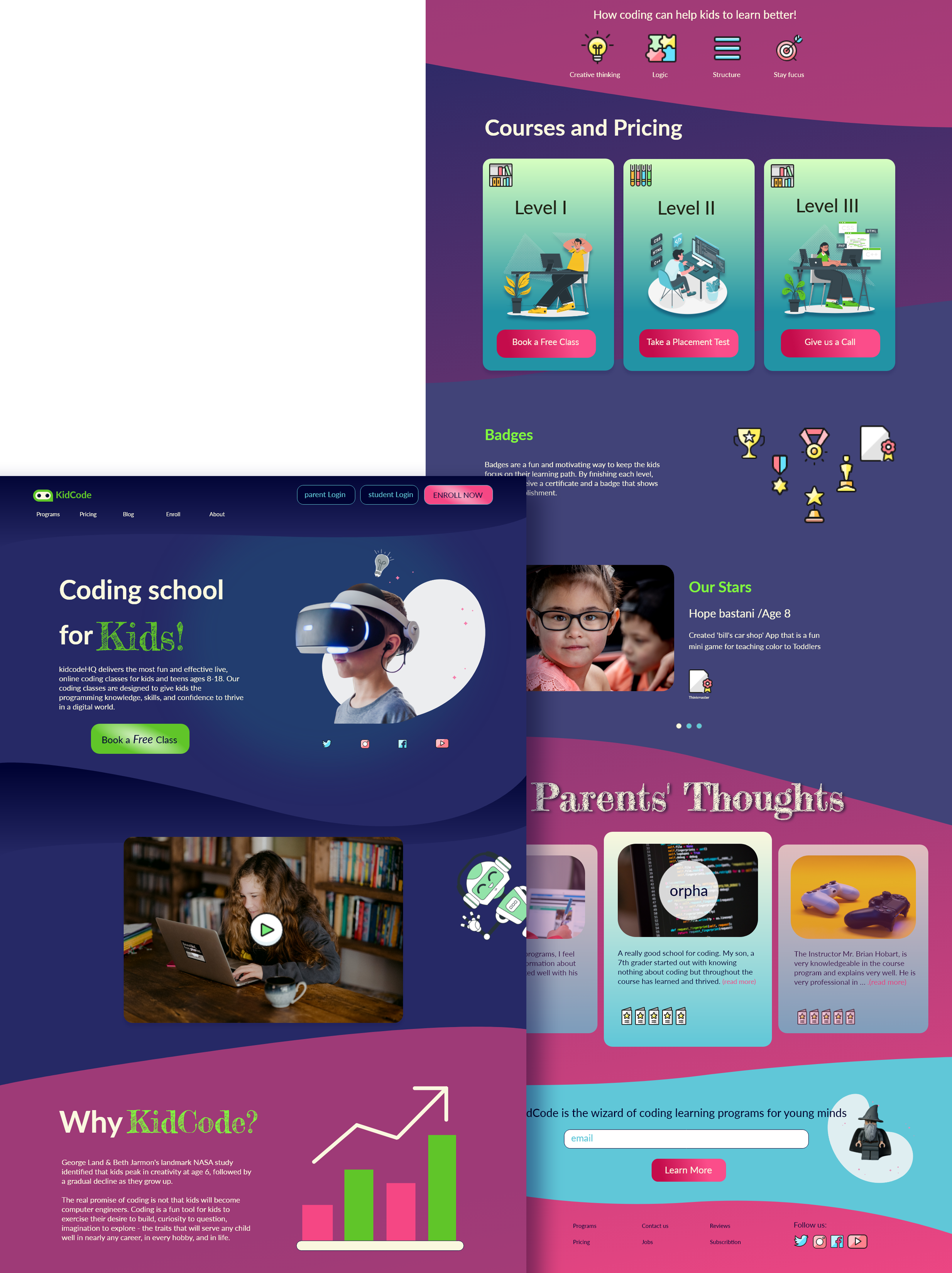
- Color Palette: Bright, high-contrast neon colors and gradients to create energy and excitement
- Typography:
- Lato for a warm, modern sans-serif base
- Frederick the Great for titles and headings—adds whimsy and structure
- Custom icons and badges that align with a gamified learning experience
- Soft curves and illustrations to appeal to younger users while maintaining hierarchy for adult navigation
UX Decisions
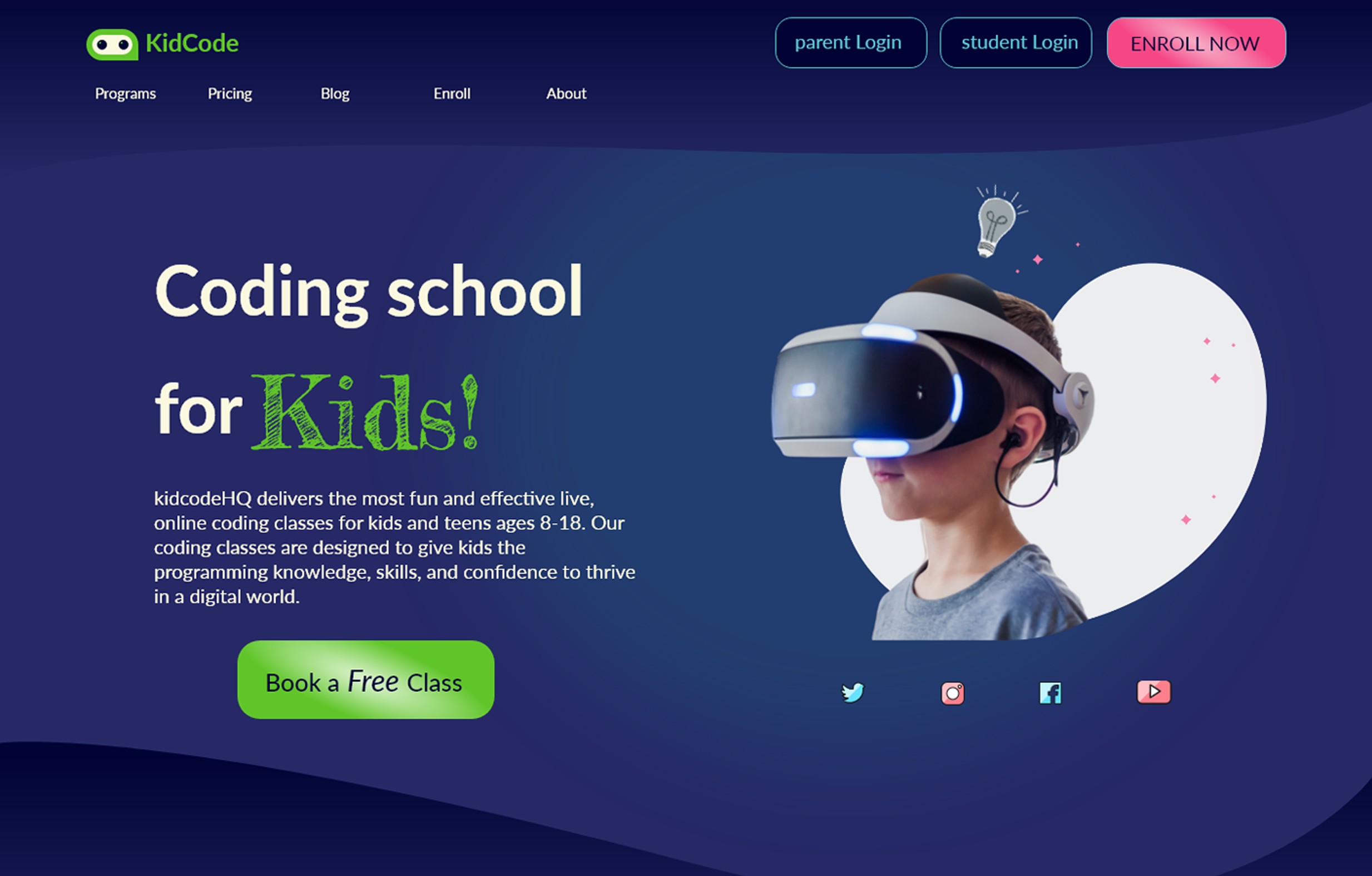
- Hero Section: Features a CTA and animated lightbulb icon. When clicked, the lightbulb triggers a dark/light mode shift for added interactivity
- Navigation: Clear, tiered system:
- Main nav: Programs, Pricing, Blog
- User login for parents/students
- Social media access
- Course Cards: Level I, II, and III are broken into interactive cards with hover states and next-step CTAs
- Video Integration: A short explainer video gives parents quick insight into the value of the program
- Testimonials & Badges: Real parent feedback and gamified reward visuals increase trust and kid engagement
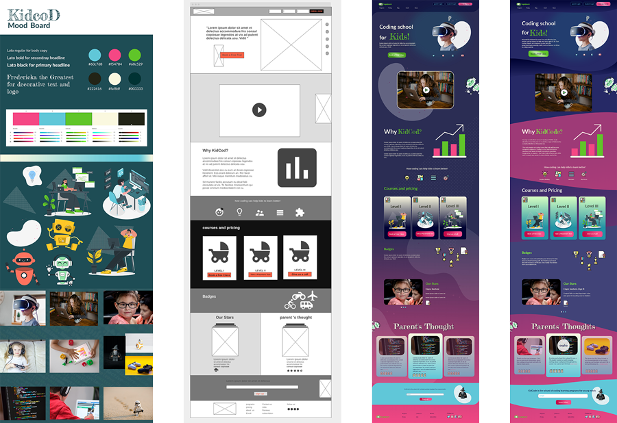
UX Process and Design Evolution
Research
- Competitive Analysis: Reviewed similar education platforms (Tynker, Outschool, Code.org)
- Persona Building: Focused on parents’ motivations (quality learning, engagement) and kids’ visual preferences
- User Flow Mapping: Key task flows from landing to booking a free class
Wireframes
- Low and mid-fidelity wireframes created for all breakpoints
- Iterative refinement based on early feedback focused on button clarity and color hierarchy
Usability Testing
- Informal remote testing with 5 parents and 3 kids
- Improvements based on feedback included spacing adjustments, form simplification, and more visual reinforcement around CTAs
Interaction Highlight: Color Mode Toggle
A custom lightbulb icon triggers a dark/light mode switch, allowing users to personalize the interface based on comfort or accessibility. This small feature introduces an element of delight for kids and control for parents, increasing emotional engagement and usability.
Outcome
Kid Code’s final design successfully:
- Balances professional clarity with childlike joy
- Clearly guides users through the site and enrollment steps
- Introduces interactive, gamified elements without clutter or confusion
Personal Reflection
KidCode allowed me to bridge creativity with empathy—designing for both children and their caregivers. It was a meaningful experience that sharpened my UX process, validated my design through testing, and demonstrated how playful aesthetics can still serve strategic business goals.
Other Projects
Let's work together!
As a visual designer, I believe aesthetics is key to improving the user experience. I am eager to learn and excited about new challenges. I am a creative, curious, self-motivated person, enthusiastic about web design, development, and new techniques. I think communication and creative problem-solving is the best way to approach and captivate the audience's need. Nothing can make me more excited than having positive effects on people's lives through visual design.
Got a project in mind?
Let's get in touch.